
Get new insights on yield variations within the field
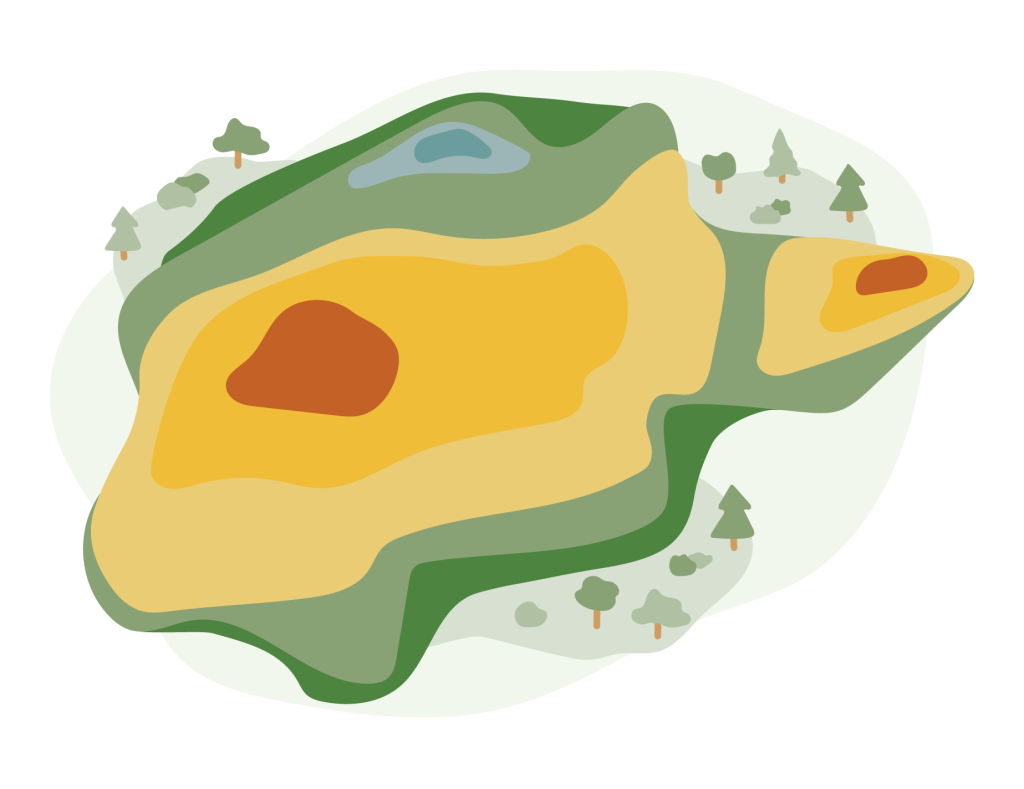
In this example, we look into how several years of yield maps can be used to gain new insights into the performance of the field and how the yield is varying over the years. AgriOpt’s AI-powered digital assistant Freja is used for the analysis. The example can be seen as a motivation and inspiration for you to start collecting yield data!
More yield data means better analysis and insights
In this example, we use three years of yield map data from cereal production to showcase some of the things you can do once you have collected yield data. As we have mentioned a couple of times in earlier Agtech Letters, the more data you have available and the better the quality of those data, the more powerful and better analyses you can do. Here, however, we are satisfied with using three years of data even though more years would be our goal. You can also include yield maps from other types of crops to see if the variation across the field is dependent on the crop type, and the different types of analyses you can do are many. However, here we show three examples.
Missing data in the yield maps are accounted for in the analysis to provide a good result, even if there is missing data for some year. Methods for handling missing data will be covered in a future Agtech Letter or Agtech Deep Dive and the details are not presented here. The yield maps for the three years are provided below.
Analyzing the deviations in yield across the field
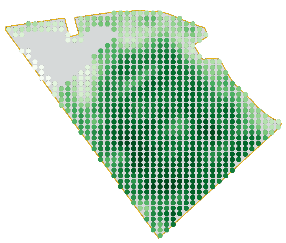
One interesting analysis that can be done once you have a few years yield data is to compute the deviation in the yield relative to the mean yield of the field at different positions of the field. This is done by averaging over all years data to find the field’s average yield, and then checking the average yield over all years for a single position of the field. By comparing these two measurement, we get a map that shows what parts of the field have performed better than average and what parts have performed worse than the average. The information can be used to give you support in finding the low-yielding areas to start focusing on improving those.
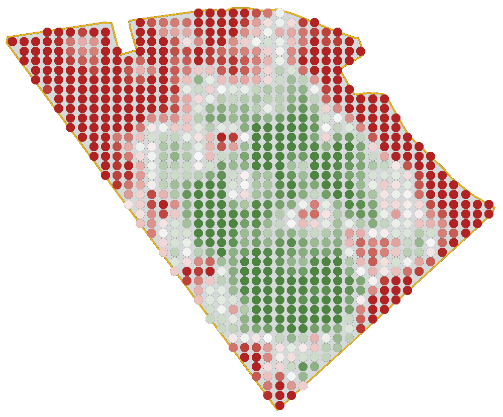
In this analysis we have used AgriOpt’s AI-powered digital assistant Freja to compute the deviation related to the average yield over three years, but other services are probably available on the market to do a similar analysis. In the image, the parts of the field that are deviating 15% or more are highlighted in dark red (lower than average) and dark green (larger than average). The lighter-shaded colors form a scale between the outer values.
From the map it can be seen that the northwest part of the field have a considerably lower crop production performance over these three years, compared to the average of the field, whereas the central and southern parts have a higher performance than the average. Almost all headlands perform worse than the average, which is in line with what we would normally expect. For you as a farmer, this information can be used to identify consistently low-yielding areas and then investigate if and how these could be improved, or if you should just treat them as low-yielding areas and not spend a lot time, effort, and inputs on these parts.
Use the analysis of deviations to understand what parts of the field that are under-performing over several years.
Analyzing the variations in yield levels between years
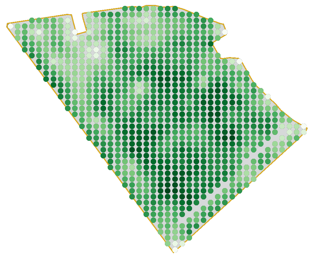
Another, slightly different, analysis is to look at how the yield levels at different parts of the field are varying from between the different years to find areas of the field where the crop yield changes a lot between different seasons.
Also this analysis is done using Freja and the resulting map is provided in the image. Every point in the map have a color depending on the behavior of the yield from year to year. Green points indicate that this position of the field have a consistently high yield every season, whereas a red points indicate that this position have consistently low yield every season. The gray points indicate that the positions are average yielding for every season, and the yellow points indicate positions on the field that have a varying yield between seasons.
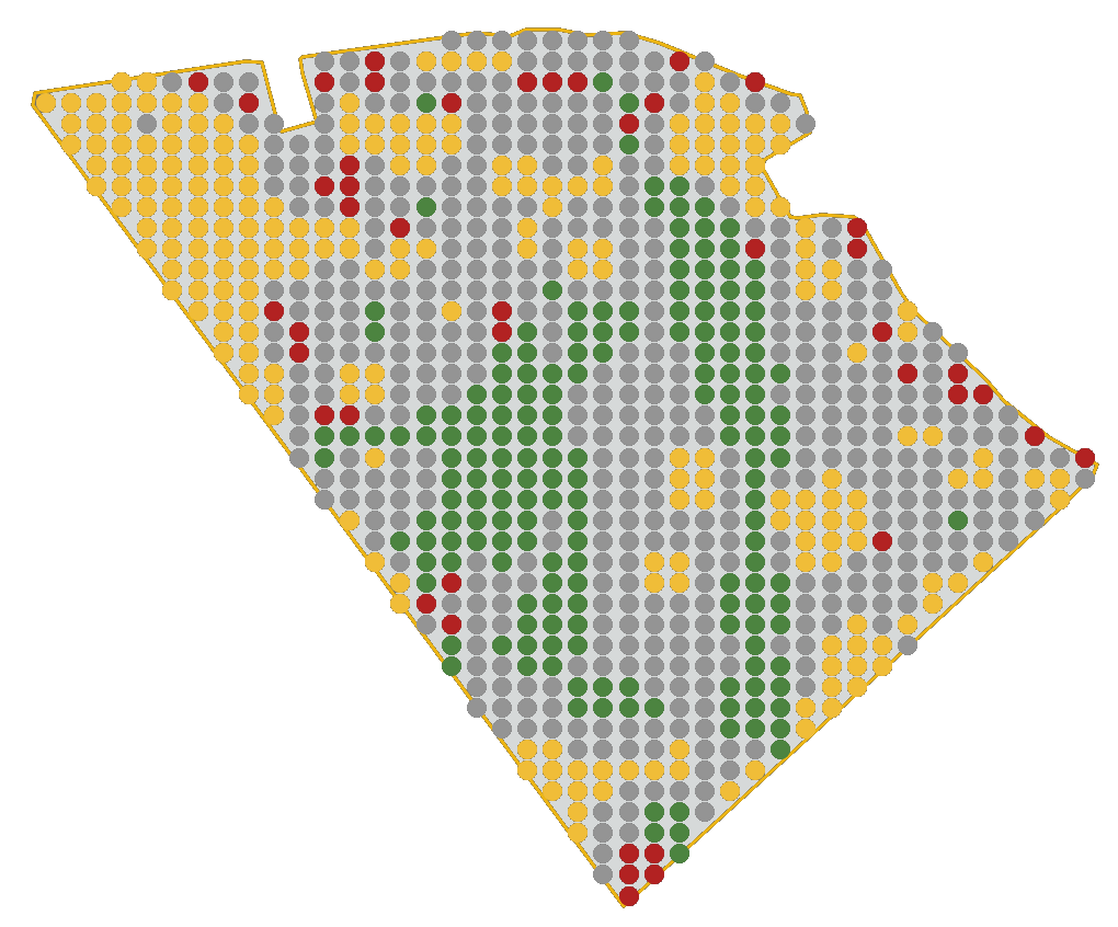
The yellow areas are extra interesting since they are probably sensitive to the crop season conditions, such as the weather, pests, and or changes in management. The variability between seasons could for example be explained by how these parts of the field are affected by different temperatures and precipitation. Hence, the northwest parts could be extra sensitive to droughts or sky falls, and could indicate the need for improved drainage or irrigation. In this particular field, the north west parts are quite sandy soils which could indicate that water stress during droughts is one of the main reasons.
Use the analysis of variations in yield to better understand how the field is affected by different seasonal changes.
Finding areas with similar patterns of the crop yield
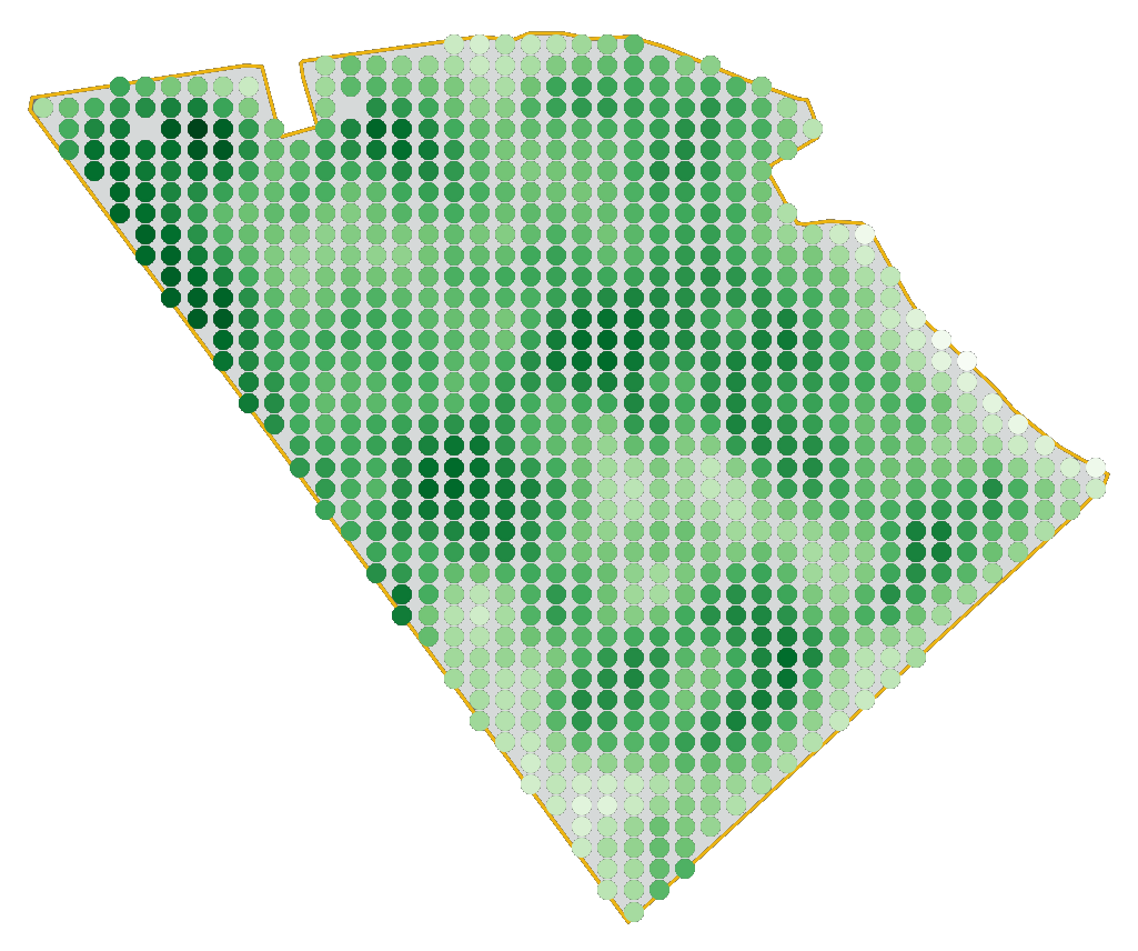
The last example of what type of analyses you can do once you have collected several years of yield data is to use it for finding areas of the field that are behaving similarly between seasons. The purpose is to understand how different inputs and actions can improve the yields and profitability, for example by creating management zones.
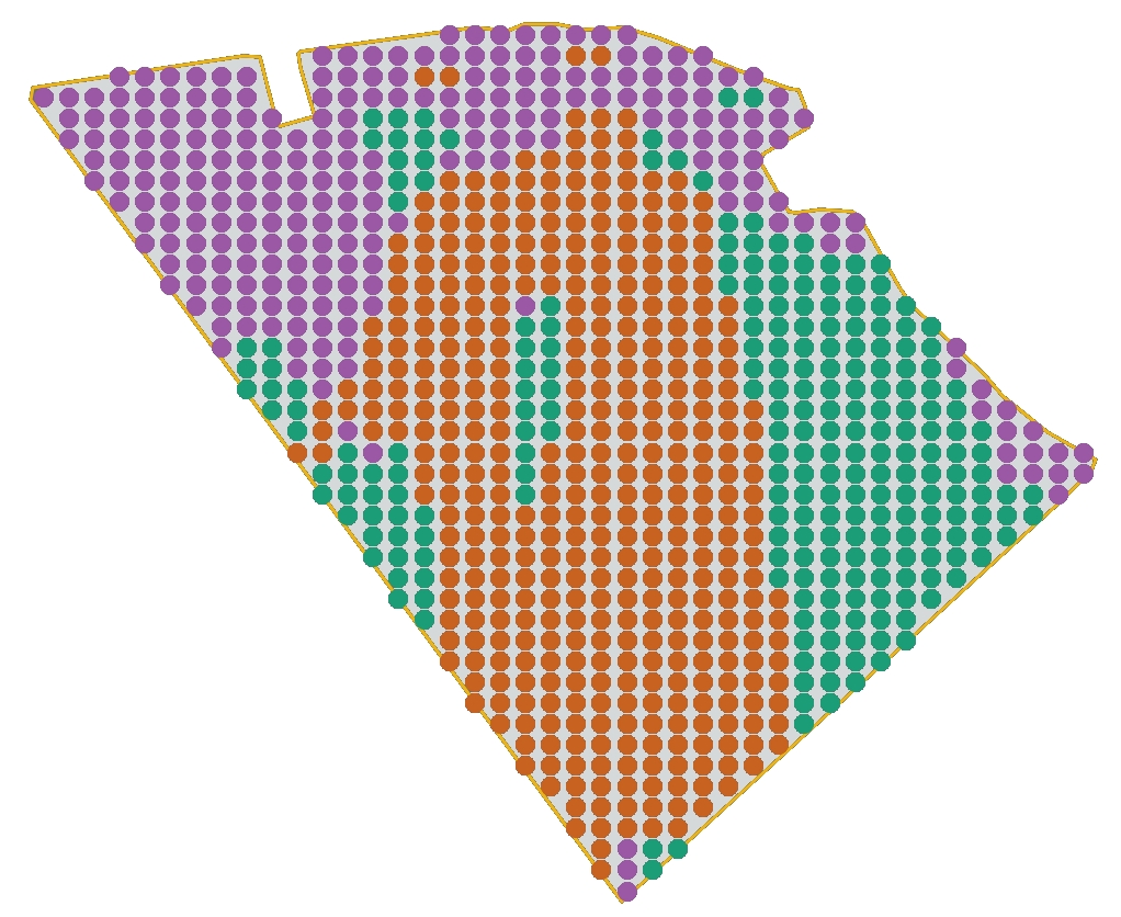
For this field, Freja has used an AI algorithm to find three different zones with similar patterns for the yield over several seasons. By remembering the two previous examples, we can see that Freja has managed quite well to capture the low-yielding and varying areas (purple), the stable high-yielding areas (orange), and the average-yielding areas (green). It is not a perfect match but the overall behavior is captured. This is by the way true for all type of analysis (whether it is AI or more traditional analysis): it is just a description of the truth, it is never a perfect match. Hence, always think of these type of algorithms as tools for your decisions.
This information could be used as a support when you create different management zones for the field to decide on what inputs to provide during the season, or for visiting certain parts of the field more often (typically the parts with lots of variations) to understand how this particular season is progressing and what yield to expect.
Use this analysis to determine management zones with similar yield patterns to tailor your actions, inputs, and field visits.
Explore and exploit your data
My academic background is partly within optimization, and in this field of study a common approach is called Explore & Exploit, which is method for solving problems in a structured way. The main idea is to exploit the data and information at any given point in time to solve a problem as good as possible, while at the same time explore how you can improve the data and information to solve the problem even better. This is a very powerful methodology that can be applied to almost any problem or business, including agriculture and crop farming. Most people already use the method, maybe without noticing, when working by the approach “I’m doing what I can with what I have available” and at the same time being curious and thinking “I wonder how I can do this in a better way?”. This combination of doing the best you can today, but still improving for tomorrow is powerful!
Why do we talk about this now? Well, let’s consider the examples in this Agtech Letter. All of the analyses provided in the examples can be used to exploit what we know and for example don’t fertilize more than needed on the low-yielding areas, while at the same time explore how to improve those low-yielding areas to become at least average-yielding. The exploit-part helps you avoid spending excessive amounts of inputs on a crop that is not very likely to need it, and the explore-part helps you find ways to improve yield in a structure way by for example improving drainage, doing limestone treatments, fertilize with micro nutrients, or whatever is missing.
An explore & exploit approach helps you avoid the common mistake to treat a bad area as a good one because you are overly optimistic about the possibilities to achieve a high yield. Use data for to your benefit!
Agtechers' Actions
Even if you don’t have a software for performing these types of analyses using several years of yield data, you can do a simpler version by simply putting 3-4 years of yield data side-by-side and then trying to do the analysis by yourself by following the reasoning in the Agtech Letter. You could improve your understanding of the field, although at more manual work.
In the next Agtech Letter we will learn more about satellites and how they can be used in farming.